November 7, 2022
When we think of a big menu with lots of items, we usually remember the old-fashioned overfilled dropdown menus. They were not especially nice to look at and the overview they gave wasn´t too great.
This is probably the reason why web designers and UX specialists abandoned the practice and now prefer the clean look of the classic single row horizontal menu we can see on most of the websites nowadays.
But what happens if you have a very large site meant to showcase your many products or services?
Internal links can get you a long way and are certainly great for your SEO while at the same time very naturally guiding the user on their customer journey. But what happens to the impatient user that landed on your home page and does not want to click and scroll trying to find out more about a specific service/product? Most likely they will give up midway and never reach the specific service/product page that you probably used a lot of time and energy creating.
If you search for best practice for menus based on design and UX, most likely the recommendation will be to keep it down to under 6 menu items and keep it as clean as possible. But in the past years we have seen the re-emergence of big pop-up menus with many items also known as megamenu.
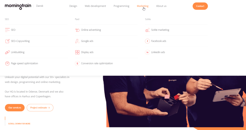
A megamenu is a large, complex menu that is often used on ecommerce websites. It is a list of links that are displayed in a large, multi-column menu when you hover over a link in the menu.
We are one of those companies that abandoned a simple, one-line horizontal menu for megamenu with almost 50 items. And it would not be in our character if we only followed our intuition and ignored the data afterwards. So, in good Morningtrain spirit – we analysed the data 4 months after the menu change.
What we expected to happen (and what proved to be correct) was the page views would increase and pages would gain more visibility.
I know what is going through your head right now – “No shit Sherlock, I could have guessed that myself”. Well, yes, I agree somewhat. But guess work and intuition can only get you so far. What I put more weight on is data. After all, so many agencies today claim to have a data driven approach, so might as well show that we don´t just talk the talk, but also walk the walk.
The data that stretches beyond the gut feeling
The data we have collected painted a clearer picture of the effects of replacing a horizontal navigational bar with a megamenu.
The main benefit being the aforementioned (and expected) increased visibility to the pages included in the menu.
To be more precise we could see that the new pages now included in the megamenu increased their views by 135% on average.
The pages that were present in the old menu as well as the new megamenu now had their visibility reduced by 38%. This was only natural because given more choice, the users went directly to the pages they were interested in, bypassing the pages they considered more general – which is what is usually displayed in the typical one-line menus.
But the data showed more than just the changes in visibility. The increased visibility of so many pages had a ripple effect on other valuable metrics on our site.
The first one was the number of pages the users visited during their session. Pages per visit metric increased by 13.5% for the entire website. Only logical that after we presented the users with more options in the menu, they were encouraged to visit more pages during their visit.
In turn, the session duration also increased by 37% on the entire website. There can be several reasons behind this. One being that helping the user find the page they were looking for more easily, reduced the number of users that got frustrated or disappointed and left the website prematurely. They also hoped from page to page less. Another can be that when the user found the page that matched their search intent, they spent more time on the page browsing through the content.
What do you gain from using a Megamenu?
Our data in combination with the best practices from UX gives a better overview of both the benefits and disadvantages.
Benefits of the megamenu:
- Increases visibility of the pages included in the menu
- Prolongs the time the user spends on the page and increases the number of pages seen by the user
- Reduces the amount of clicks necessary for the user to reach the page
- Categorizes your pages into clusters and makes it very clear for both the user and Google how they relate to each other
- the megamenu gives the website a more modern look and feel
- allows us to showcase more of our content in a more engaging way.
Disadvantages of a megamenu:
- Decreases the number of page views on the more general pages usually used in the horizontal menus
- Difficult to keep the same, clean design and good overview on mobile devices (creating problems for sites with a predominant mobile audience)
- If not designed properly, can make your site look cluttered and overwhelming
Overall, the advantages of the megamenu outweigh the disadvantages. The megamenu is a helpful addition to the website that encourages users to explore more pages and spend more time on the website.
Would your website benefit from a megamenu? The answer is that it depends. It depends on the size of your website, the size of your user base, the devices your users use to browse your site and your business goals. If you have a website with a lot of pages of equal or similar value and you want your users to be able to find all these pages easily, then a megamenu might be a good idea.
If your data shows that 4-5 of your pages create the most value and are responsible for the bulk of your conversions, then by all means keep your horizontal menu bar.
Keep an eye on your data and use your menu as a way of directing the traffic to the pages that have the best conversion rates and a proven track record of creating value for your company.


